Marks of Making
I'm a big fan of Tom Sachs's art. Something about it resonates with me — though for a while I couldn't fully articulate why, until I came across this video by Van Neistat, Tom's former studio assistant (and now one of my favorite Youtube creators).
For one exhibition, Sachs was planning a 17-foot-long scale model of Le Corbusier's Unité d'Habitation building, constructed of hot glue and foam core. Van was tasked with fabricating the model — tediously gluing individual strips of foam on, by hand. To speed up the process, Van devised a crude, makeshift fixture for holding glue and strips. He called it his "handy contraption".
Surprisingly, Tom loved the contraption. When the exhibition displayed at the Guggenheim, Tom decided to display it on a pedestal, as its own piece of art, next to the model that it helped create.
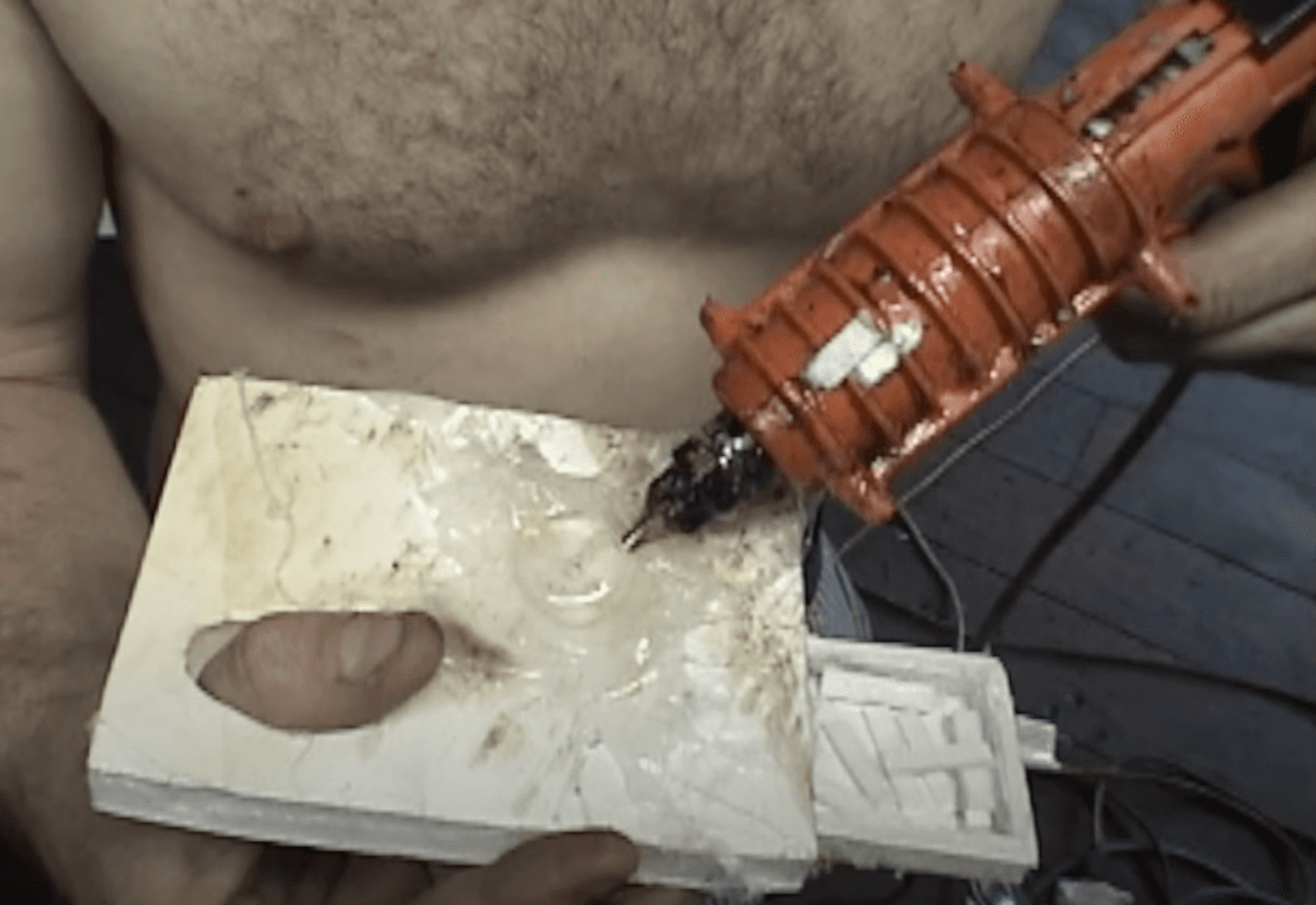
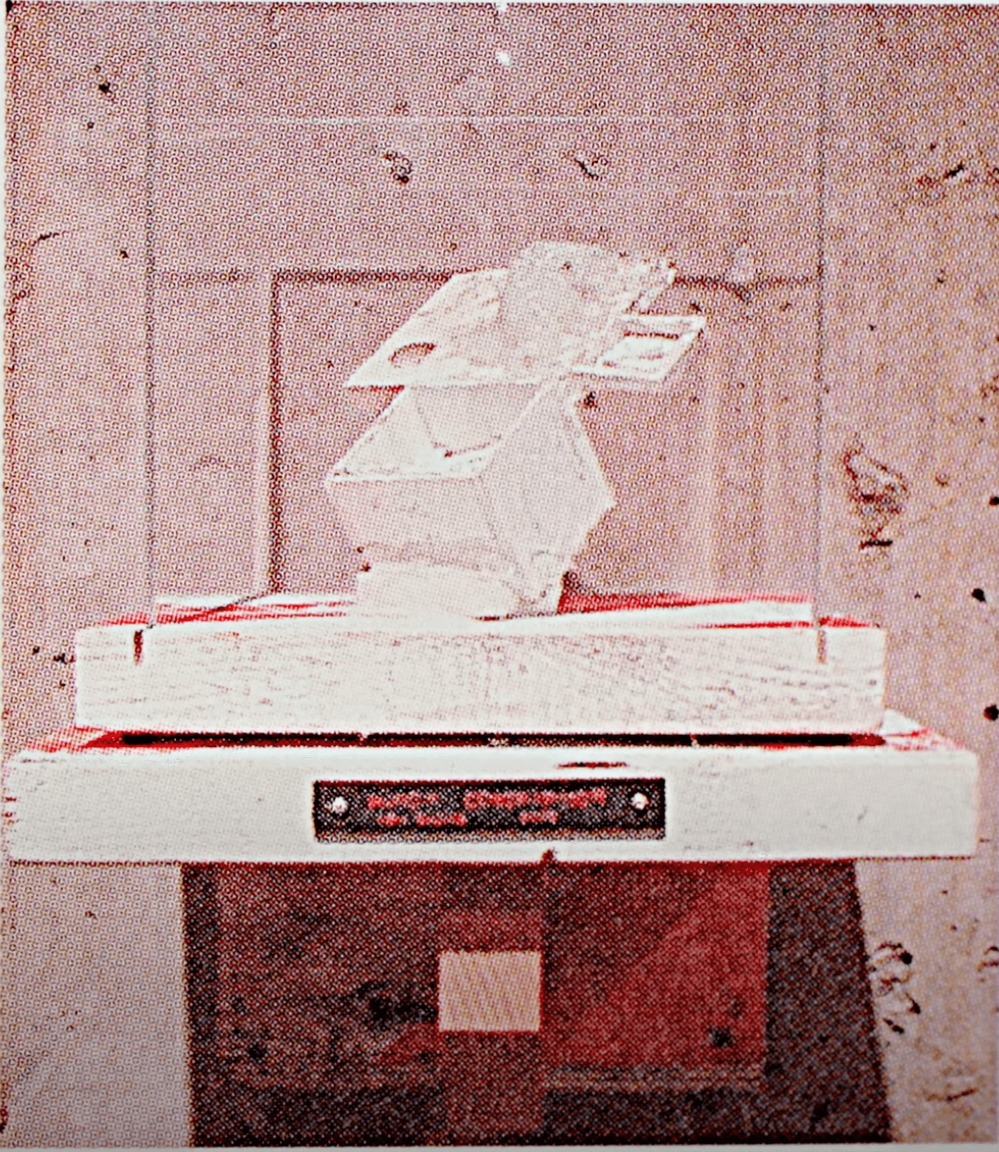
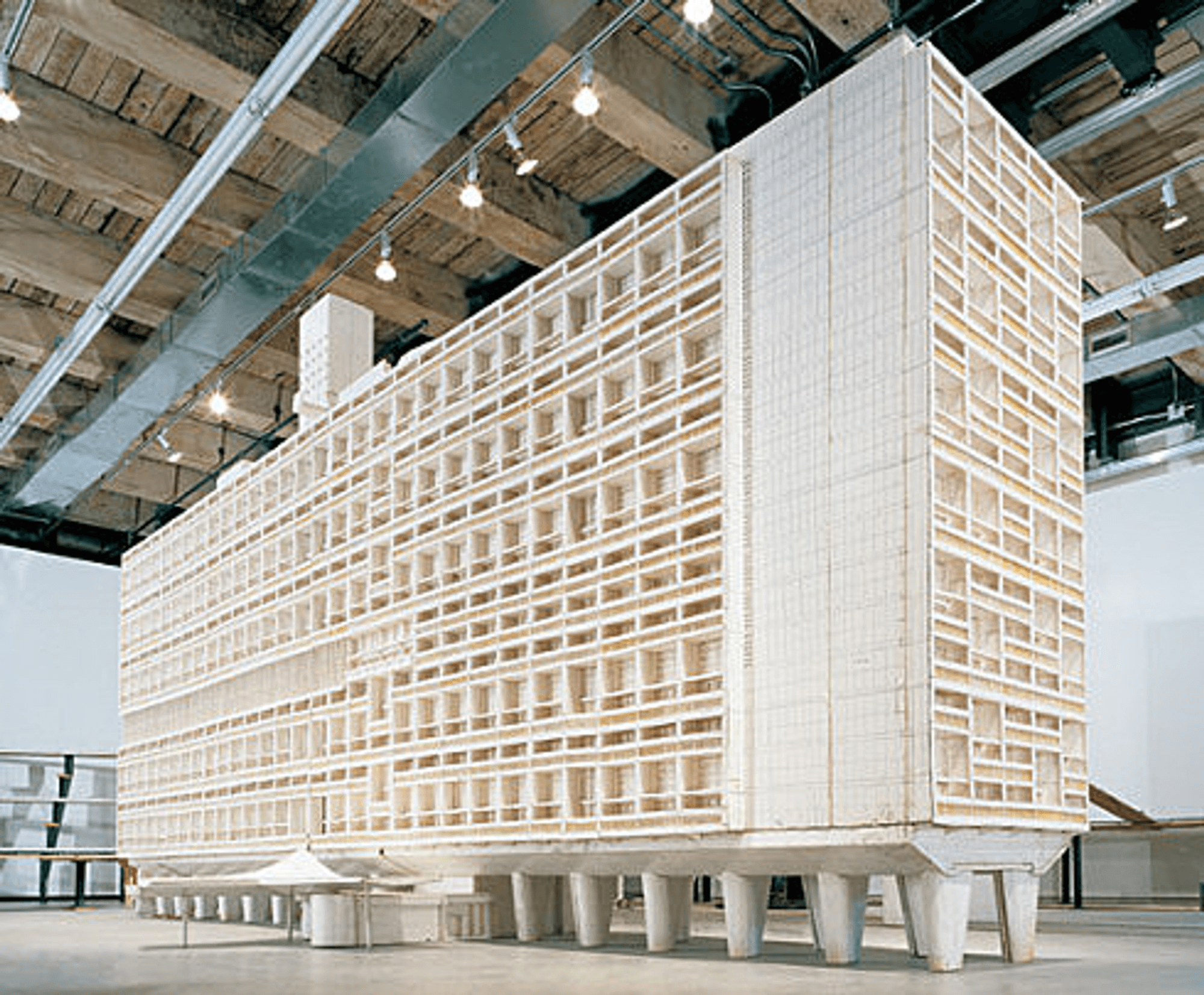
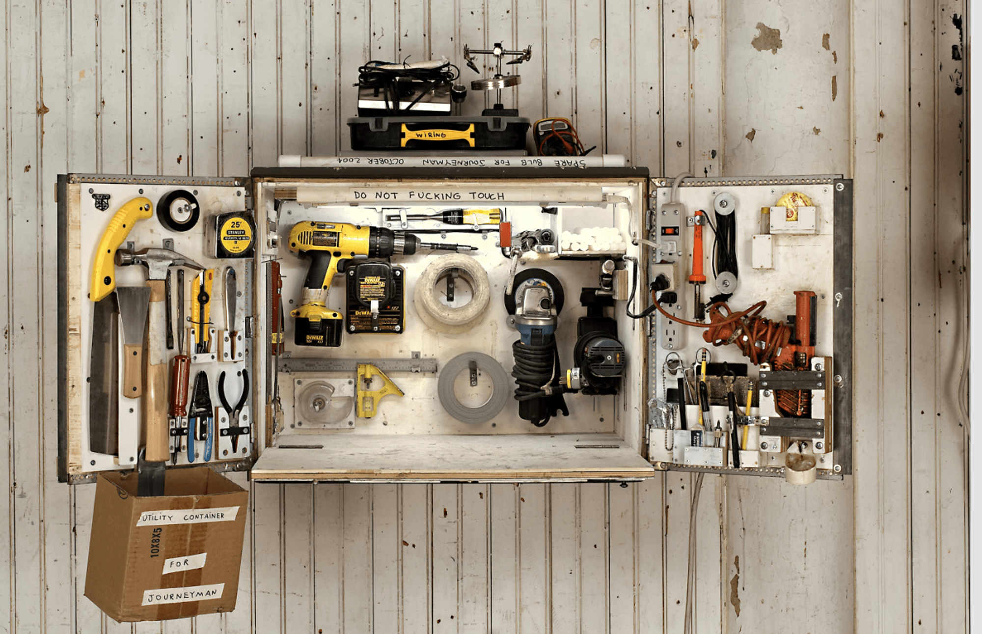
I love this idea — that the tools which create a piece of art become exposed as part of the art itself. The Unité sculpture is impressive as a finished object, but to make an accurate scale model of this size is a feat of its own. Artifacts like the "handy contraption" remind you of that.
More generally, that's what I like about Tom Sachs's art — it all feels made, by a real person. It is not some perfect monolith handed down from the gods. You can examine the details of each piece and posit how it was constructed, see where mistakes were made and corrected, and read the notes the creator left for himself.
When I look at a sculpture like La Pieta, I see no artifacts of its creation process. For all I know, Michelangelo snapped his fingers and the marble spontaneously rearranged itself into shape.

Much of design today is dominated by pure, polished forms, like the iPhone. Apple has the most advanced manufacturing processes in the world, but you would never know it by examining its products — they're beautiful, yet opaque. Jonny Ive famously envisioned a "single slab of glass" as the iPhone's ultimate form.
"I can never make something as perfect as an iPhone, but Apple could never make something as flawed as what I do" — Tom Sachs
So what other objects expose the details of how they were made?
The tweet below is what inspired this essay; I was originally just going to write about Tom Sachs but didn't feel I had enough to say.
This "Contoured Corinthian" column was made by Monumental Labs, a startup working on low-cost stone carving using robotics. Though the piece is shown in an unfinished state, I oddly like the way it looks. It tells me something about how it was constructed — by cutting down pieces of material with a drill bit. The reason it looks like a topographical map is that it's more efficient to cut away the bulk of material in a roughing pass, then follow up with smaller drill bits to smooth out the details. If they're going for a "pure" finish, they'll take another pass to abstract away this manufacturing artifact, but if cost and speed are considerations, I would be fine to leave this as is. Maybe one day these grainy contours could even become a revered aesthetic detail. [1]
Objects that expose their "marks of making", or artifacts of how they were constructed, are a reminder that everything is made. Nothing simply appears. In a time when most people are wholly detached from making anything they consume, it's easy to lose sight of that fact. I'm not necessarily lamenting this disconnect, but I appreciate any design which reminds us (whether intentionally or not) that it was made.
Every manufacturing process has its constraints and resulting artifacts. Most products try to hide them. For example, injection molding requires ejector pins to push a completed part out of the mold. As the plastic hasn't entirely cooled when ejected, these pins leave small divots in the part. [2] Most molds are oriented such that the ejector pin marks appear in a hidden location, such as on the internal face of the part. And that's fine! Manufacturing artifacts can be ugly. But not always.
In an interview about his film Fantastic Mr Fox, Wes Anderson talked about his decision to use stop-motion characters with real fur. Fur is not typically used in stop-motion because each manual adjustment between frames slightly changes the fur's position, giving an unnatural rippling effect. The film's animators pushed back against this decision, but Anderson didn't care because he actually liked the way it looked.
Most movies try to fully immerse their audience into the world of their story, using whatever CGI necessary to cover up any artifacts of the production process. In contrast, Anderson wanted to enunciate the idea that this movie was made. It was made in a studio, with stop-motion, repositioning furry puppets by hand, frame by frame, for 87 minutes worth of images. The production process is obviously apparent in the final product. Rippling fur is a mark of making.
Some furniture pieces purposefully expose their joinery, even choosing contrasting stains of wood for mating parts, to highlight their craftsmanship. Concealed joinery can hide a mess of glue and nails, just as an opaque electronics casing can hide a rat's nest of wires. Furniture makers highlight their joinery as proof-of-work, to tell us that they did not cut corners with their cut corners. [3]

A related idea is a product which exposes not how it is made, but rather what it does. This is equally interesting to me, and equally opposite to the Apple style of abstracting all complexity from the user.
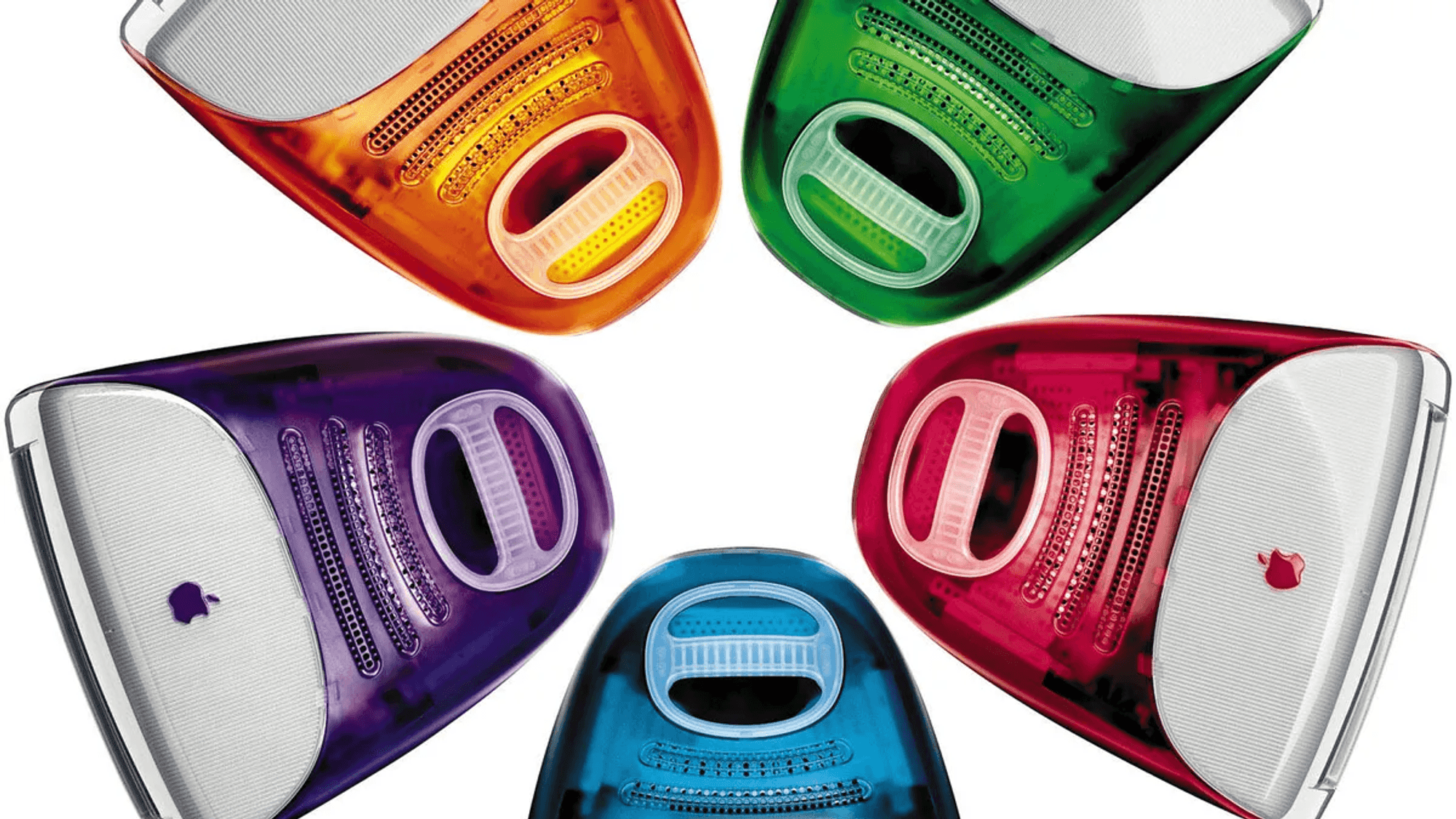
For what it's worth, Apple wasn't always this way. The translucent iMacs of the early 2000s gave us a glimpse into their internals. Products which expose their inner workings remind you that they aren't black boxes — they're powered by real, logical mechanisms. This is a trite-sounding but under-appreciated fact, and we'd be better off to remind more people of it. I remember a mini aha moment when I first discovered that the haptics in my Playstation 2 controller were triggered by an asymmetrically-weighted rotating disk. [4]

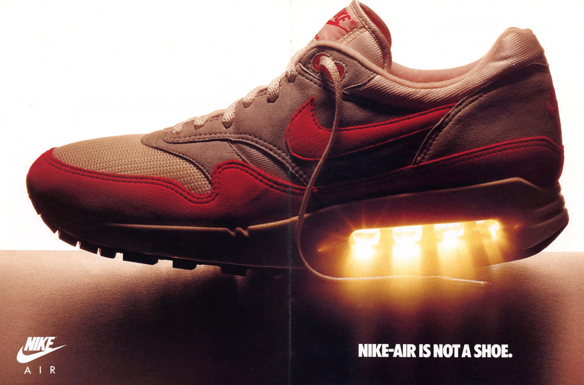
One of my favorite sneakers is the Air Max One. Nike first debuted Air Max technology in 1978 with the Tailwind, but tucked it deep inside the midsole for no one to see. The Tailwind was successful, but people didn't fully grasp the concept. You just had to take Nike's word for it that "air" was helping you run faster.
Nearly 10 years later, designer Tinker Hatfield had a brilliant idea — what if we expose the air bag externally, so people can see exactly how the technology works? The result was the Air Max One. Hatfield was actually inspired by the Pompidou Center, a building which he remarked as "spilling its guts out into the world". [5]
Not only did Piano [the architect] and his team expose all of the inside of the structure and the mechanical systems, but he painted everything in bright colors, because he wanted those things to be visible from a distance, to be striking...and that's what happened with the Air Max too — Tinker Hatfield

No product is under any obligation to prove how it was made, or to let us in on the details of how it works. Objects can be divine monoliths, I'm fine with that. I just find it interesting when they reveal their marks of making for everyone to see.
Footnotes
[1] People underappreciate just how many lasting aesthetics are borne incidentally from functional constraints. It's most obvious in architecture, from flying buttresses and vaulted ceilings (support structures) to subway tile (easy surface to clean) to crown molding (concealing misalignment). This topic deserves an essay of its own.
[2] You can see the ejection pins doing their job at 2:01 in this video.
[3] Ironically however, Apple products' internals are just as beautiful as their externals, but most users will never know. Unless they listen to Jonny Ive serenade on the properties of aluminum in a marketing video.
[4] Steve Jobs has a famous quote, "Life can be much broader once you discover one simple fact: Everything around you that you call life was made up by people that were no smarter than you...and you can change it, you can influence it, you can build your own things that other people can use." People misinterpret this quote. They think it implies that anyone is as smart as anyone else; they think it denies innate intelligence and ability. But it's really a quote about personal agency. Everything in the world seems at first glance like an opaque interface, but if you take a closer look, it's composed of smaller, more manageable pieces. Most people just look at the interface, get overwhelmed by complexity, and never consider what composes it. Even if you don't have the same level of genius as Einstein, you can still get extremely far in life by decomposing complex problems into smaller parts.